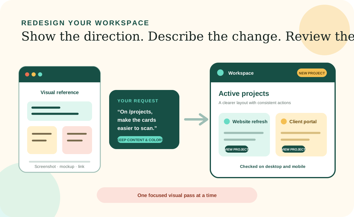
You do not need to know how to write code to redesign a Desktop Workspace. You need to help the coding agent understand which page you mean, what feels wrong, what result you want, and what should remain unchanged. The agent can inspect the existing workspace, find the relevant files, make the visual changes, and show you what it checked.
Visual work usually improves through a few focused passes. Begin with one page or one shared element, give the agent concrete references, review the result in the browser, and describe the next adjustment in plain language. A clear conversation is more useful than trying to produce one perfect design prompt.
Start with a clear target
Name the page before you describe the change.
Tell the agent exactly where to look. You can use the page name, such as the Client Overview page, or the URL path shown in the browser, such as /clients or /projects/active. If several pages look similar, provide both. A screenshot with the area circled or annotated can remove even more ambiguity.
Then separate the desired outcome from the implementation. You might say that the page feels crowded, the most important action is hard to find, or the mobile layout is difficult to scan. The coding agent can inspect how the page is built and decide which files or styles need to change without requiring you to name them.
Use interface vocabulary
A few common design terms make your requests much easier to locate.
You can still describe an element by its text, color, or position when you do not know its name. Interface terms simply give you and the agent a shared shorthand. Combine the term with a visible label whenever possible, such as the Save button in the header or the Recent Activity card in the right sidebar.
Header and footer
The areas at the top and bottom of a page. A header often contains the logo, page title, navigation, account controls, or primary actions.
Main navigation and sub-navigation
The primary links between major areas and the secondary links within one area. On small screens, navigation may move into a menu or drawer.
Hero and page heading
The prominent opening area and the main title that explain where the user is and what the page is for.
Section, card, and panel
Containers that group related information. Cards are often repeated; panels or sections may hold larger parts of the page.
Button, link, and call to action
Controls that perform an action or move to another page. A primary button is usually the most important action in an area.
Sidebar and content column
A narrower supporting area beside the main content and the primary reading or working area of the page.
Tabs and breadcrumbs
Tabs switch between related views. Breadcrumbs show the page's place in a larger hierarchy and provide a path back.
Form, field, dropdown, and checkbox
Elements used to enter or select information. Refer to the visible field label so the agent knows exactly which control you mean.
Table, list, and grid
Different ways to organize repeated information. A table emphasizes rows and columns; a grid often arranges cards across the page.
Modal, dialog, drawer, and tooltip
Temporary interface layers. A modal or dialog appears over the page, a drawer slides from an edge, and a tooltip provides a small hint.
Typography, spacing, alignment, and contrast
Useful terms for text appearance, breathing room, how elements line up, and how clearly content stands out from its background.
Show what you mean
Mockups, screenshots, and design links can become a visual brief.
You can attach a rough sketch, a screenshot from the current workspace, a mockup made in a design tool, or a link to another website whose design you like. The example does not have to be polished. Even boxes drawn on paper can communicate hierarchy, grouping, and where you expect actions to appear.
When you share a reference, explain what to borrow from it. You may like its generous spacing, compact navigation, card shape, type scale, calm color palette, or mobile menu. You may dislike everything else. Naming the useful qualities helps the agent treat the reference as inspiration instead of trying to copy an entire design or recreate another company's identity.
For links, point to the exact page rather than only the site's home page. Mention the section or interaction to inspect, and say whether the reference should influence one component, one page, or the whole workspace. If the agent cannot access the link, attach screenshots of the relevant desktop and mobile views.
Build a useful request
Give the agent a target, outcome, boundaries, and a way to check the work.
A good visual request does not need to be long. It needs enough context to prevent the agent from making broad guesses. The following sequence works for a small change or a full page redesign.
Identify the page or shared element
Use the page name, URL, visible heading, or component name. Say whether the change applies only there or across the workspace.
Describe the problem in user terms
Explain what is hard to find, understand, read, or use. Include the people or devices most affected when that matters.
Describe the desired visual direction
Use a few qualities such as calmer, denser, friendlier, more professional, easier to scan, or more visually consistent, then connect them to concrete elements.
Set boundaries
Name the information, behaviors, brand colors, components, or other pages that must remain unchanged.
Ask for inspection and verification
Have the agent review the existing design first, reuse established patterns, test the page, and check both desktop and mobile views after the change.
Work in focused passes
Review structure before asking for polish.
For a large redesign, begin with hierarchy and layout: what appears first, what belongs together, and which action should be most prominent. Once that feels right, refine typography, spacing, color, borders, shadows, and small interaction details. This order prevents time being spent polishing a layout that still needs to move.
Ask the agent to change one page first when a new direction may later spread across the workspace. Review that representative page, agree on the pattern, and then ask the agent to apply the approved approach to the other affected pages. This creates a useful checkpoint before a visual idea becomes a system-wide change.
Give actionable feedback
Point to what changed, what works, and what still feels wrong.
Feedback such as “make it better” forces the agent to guess again. Identify the page and element, describe the issue you see, and request a direction. For example: the header on /dashboard is too tall, reduce its vertical spacing; the secondary button competes with the primary action, make it quieter; or the cards are difficult to scan, align their titles and actions consistently.
You can also ask the agent to compare the current result with your reference and list the remaining differences before editing. If something becomes worse, say what should return to the earlier version and what new work should remain. Focused feedback makes each pass easier to understand and recover.
Protect usability
A visual improvement should still work for every user and screen.
Ask the coding agent to preserve existing behavior, readable contrast, keyboard access, visible focus states, clear form labels, and meaningful button and link names. Important information should not be communicated by color alone. Screenshots can show appearance, but the finished interface also needs correct structure and interaction.
Have the agent check narrow mobile widths as well as a typical desktop view. Ask it to test the relevant page and report any limitation it could not verify. A successful redesign is not only more attractive; it makes the workspace easier to understand and use without introducing regressions elsewhere.